Some designs need precision, not noise. Our Elegant & Sharp Hindi Fonts collection features sleek, high-contrast Devanagari typefaces that look premium. Designing a magazine cover? A corporate presentation? A YouTube thumbnail? These sharp Hindi fonts give your headings a sophisticated edge.
Why Use Sharp & Elegant Hindi Fonts for Headings?
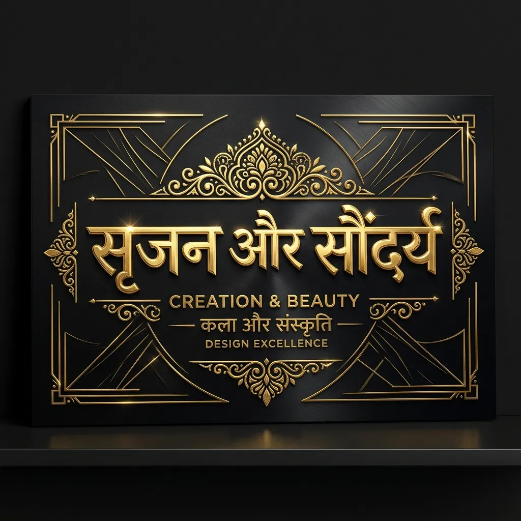
Bold fonts are heavy. Elegant fonts are refined. Use them when style matters as much as readability:
- YouTube Thumbnails: Sharp fonts stand out against busy background images. Your video titles pop on mobile screens.
- Magazine & Editorial Design: Give Hindi articles a high-fashion, editorial look with elegant serif headings.
- Premium Branding: Luxury brands and boutique businesses use elegant typography to show class.
- Infographics: Make data look clean and modern with sharp Devanagari titles.
How to Use Sharp Hindi Fonts in CapCut & YouTube Thumbnails
Get the best results from heading fonts:
- Download the TTF: Save your favorite elegant font using the "TTF" button above.
- Use in CapCut: Import the font into CapCut's library. Use it for your main hook text. Pair with a simple English font for subtitles.
- YouTube Thumbnail Tip: Add a "Stroke" or "Drop Shadow" to elegant Hindi text in Photoshop or Canva. Sharp edges stand out against any background.
Explore More Hindi Font Styles
- Need heavy impact? See Bold & Decorative Hindi Fonts.
- Want a clean minimal look? Check out Modern Minimalist Hindi Fonts.
- Looking for artistic flair? Try Calligraphy Hindi Fonts.
Key Features
FAQs about Elegant & Sharp Hindi Fonts
Which is the best Hindi font for YouTube thumbnails?
Ams Kesri and Ams Vardan are top picks. Sharp, readable on mobile, and they grab attention without looking bulky.
What is the difference between bold and sharp fonts?
Bold fonts are thick and heavy. Sharp fonts have refined edges with varying stroke thickness. Use bold for banners. Use sharp for magazine-style headings.
Can I use these elegant fonts for body text?
Not recommended. Display fonts are designed for large sizes. Small body text becomes hard to read. For body text, use Mangal or Minimalist fonts.